UnitedHealth Group Analysis: Defensive Healthcare Scale Amid Regulatory and Margin Pressures
$407.34
12 Jun 2026, 17:06
Neutral

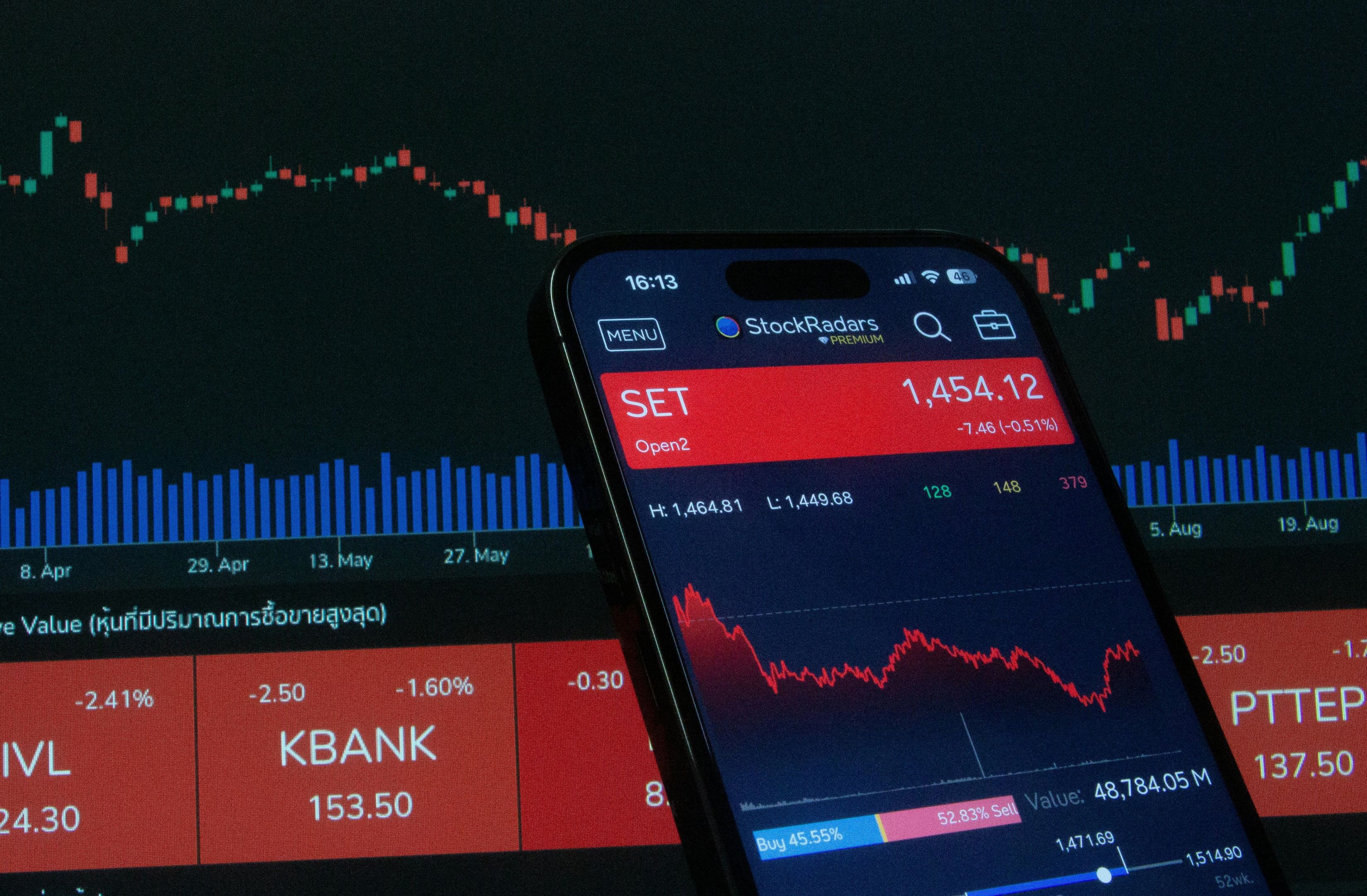
Join Minipip Academy and access free courses in investing, trading, economics, and more.
Sign Up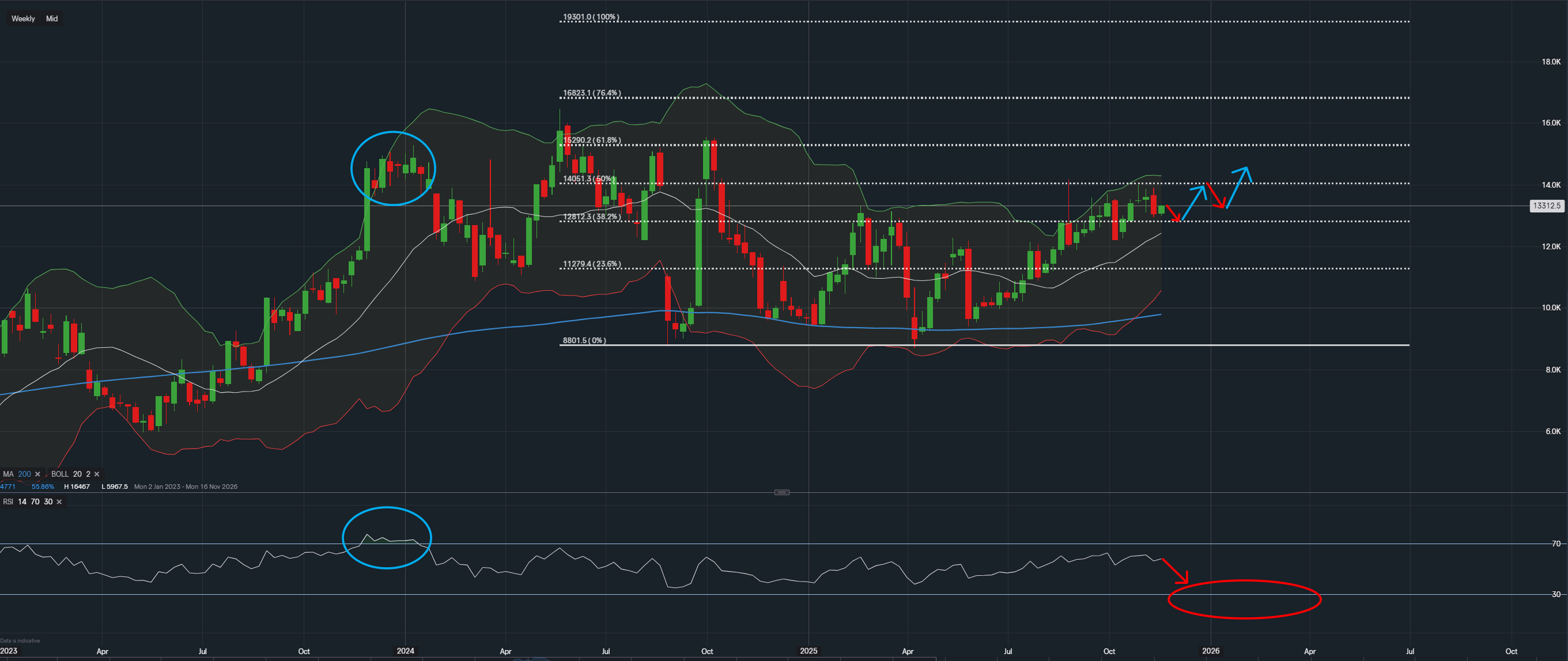
Data from IG - Timeframe - Weekly
Market Overview
PDD Holdings currently trades on a P/E Ratio of 14.18, with a forward P/E Ratio of 10.90, a relationship that often reflects expectations of profitability over the next year. At the same time, earnings projections show a softer picture. Last year’s EPS of $2.41 compares with a consensus forecast of $1.99, suggesting a potential reduction of around 17%. This aligns with its year-on-year market summary, which also reflects a period of cooling performance.
Analyst sentiment appears divided. While the company carries a rating of 13 on TipRanks, the breakdown reveals 8 buy ratings and 5 holds, indicating a degree of hesitation rather than a strong tilt in one direction. Overall, the fundamental backdrop presents a blend of supportive valuation metrics alongside tempered expectations.
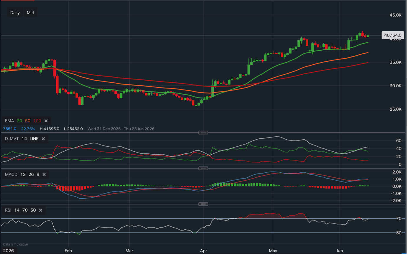
Technical Structure and Price Behaviour
On the weekly chart, price has been moving upward from the earlier low near $88.01 and is now interacting with an important region between $133.00 and $140.50. This area was previously highlighted in the blue circled section on the chart, where price encountered difficulty progressing. The current candles are showing a similar hesitancy, which may be a reflection of the same underlying supply.
The broader trend still carries characteristics of a recovery, but the nearer-term structure suggests that the market is approaching an area where decisions have historically been made.
Fibonacci Extension Positioning
The Fibonacci extensions drawn on the chart continue to outline potential zones of interest. The extension around $140.51 has previously coincided with shifts in market behaviour, acting as a kind of midpoint reference during earlier movements. Should price remain in this region, the chart shows a higher extension near $159.00, which represents another technical area that has been relevant in past swings.
At the moment, price appears to be testing the surroundings of the mid-level extension rather than decisively moving away from it, which keeps multiple possibilities open for future movement.
Momentum Signals and RSI
The RSI gives additional context. In the earlier blue-circled period, the indicator rose into elevated territory before softening, which aligned with price hesitation near resistance. In the present red-circled area, RSI is once again tilting lower, suggesting that momentum may currently be easing.
This shift does not necessarily indicate directional intent but rather reflects that the market may be entering a period where movement could slow, consolidate, or temporarily retrace as part of normal price behaviour.
Potential Market Scenarios
Based on how price typically responds to similar structures, several possibilities exist.
One potential scenario is a movement back toward the $128.12 region, which has behaved as a natural consolidation area before. A further move toward $117.79 could also be possible if momentum continues to soften, and such behaviour would still fit within the broader pattern seen on the chart since the recovery began from $88.01.
Another potential scenario is that price stabilises near its current levels, leading to a period of sideways movement beneath $140.50. Price has shown in previous cycles that it can remain within such ranges before establishing a clearer direction. If the market were to compress in this region, it may eventually revisit levels above or below depending on how momentum develops.
Both possibilities reflect typical market behaviour around key technical zones and do not imply any particular outcome, only that the chart structure supports multiple paths depending on how price and momentum evolve.
Conclusion
The combination of valuation metrics, earnings projections, analyst sentiment, and technical positioning paints a picture of a market in a balanced state. The long-term trend still reflects recovery characteristics, while the short-term picture shows a period of hesitation near an area that has previously influenced price behaviour.
Nothing in the current structure points definitively in one direction. Instead, the chart highlights a range of possible outcomes, each of which aligns with how markets often behave when interacting with regions of historical significance.
Disclaimer:
This analysis is for informational purposes only and should not be considered financial advice. Investors and traders should conduct their own research and consider individual risk tolerance before making any investment decisions.

Tradable assets:
Min.Deposit:
Max Leverage:
FCA:

Rating:
 Earnings Calendar
  Economic Calendar
  VAT Calculator
  Tax Free Childcare Calculator
 Percentage Calculator
 Compound Interest Calculator
  Loan Overpayment Calculator
 Mortgage Calculator
 Credit Card Calculator
 Investing
  Economics
 Trading
  Technical Analysis
  Personal Finance
 Calculator